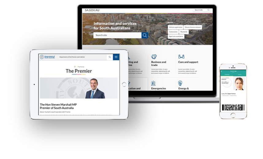
While some jurisdictions have moved away from the concept of a single, whole-of-government website in recent years, the South Australian government is doubling down on its offering, sa.gov.au.

The Department of the Premier and Cabinet has just emerged from a two-year refresh of the state’s single information portal, which recently celebrated its tenth birthday.
The overhaul, spearheaded by the department’s ICT and digital government division, has prompted a fundamental rethink of the citizen-facing website to keep government websites consistent.
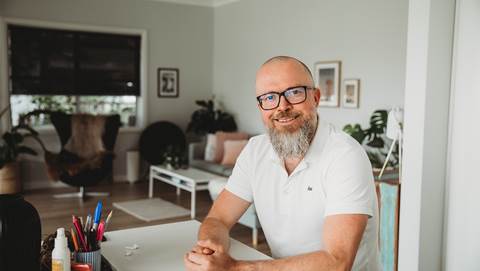
Much of this stems from the launch of a new website design system, which the department’s head of digital citizen services Nick Condon describes as “wix or squarespace for government”.
“We're able to say to agencies, instead of going and reinventing the wheel, use the design system, use the pre-built government templates to build your website and not only just citizens get a better experience, but there is also huge cost avoidance for government,” he said.
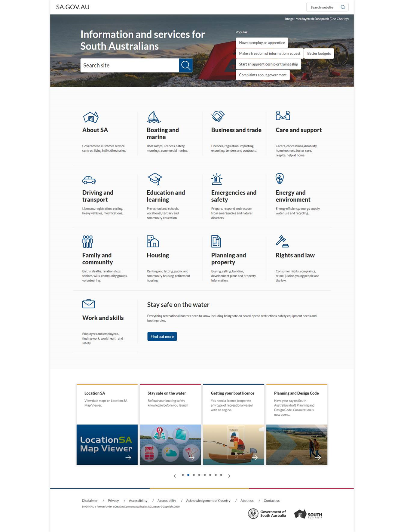
The design system, along with an equally new content toolkit and the underpinning Squiz digital experience platform, has allowed the government to introduce a universal design language to keep version six of sa.gov.au consistent.
It takes pointers from the Digital Transformation Agency and the NSW government, which have both also developed design systems over the past two years, to allow agencies to easily create websites with a “single brand, single experience”.
With currently around 25 modules available for “anything from content bins to rotators and carousels and promo bins and how you use video”, the design system allows agencies to avoid approximately $2 million that would otherwise be spent.
“We really want to have agencies investing their money in improving services, not just creating another basic page for a website,” Condon said.
He said this work could also be done by the Office of Digital Government, which has a dedicated team of content editors.
“An agency can come to us and say they need a site and we can using that toolbox build them up a digital experience that’s consistent and gets the economies of scale,” he said.
In addition to sa.gov,au, the universal design language has also been adopted by a further 23 websites used by government agencies as corporate sites.
“People don’t wake up in the morning to check out the latest machinery of government changes, and which office or agency in which directorate are doing what,” Condon jokes.
“Citizen don’t care. They’ve just got a transactional need, and they want to get it fixed as quickly as they can and move on with their life.”
Two years in the making
While sa.gov.au first entered the scene back in 2010 as one of Australia’s first whole-of-government websites, the environment around it has changed remarkably over the last decade.
This is particularly important given that sa.gov.au, which has amassed 1400 pages of content and 333 services from agencies, has grown by four million user sessions over the last five years.
“We’ve gone, in the space of seven years, from everyone starting on the homepage to effectively 85 or 90 percent of our traffic going direct to the page from usually Google,” Condon said.
“And when you land a citizen looking at a page of content effectively in the middle of a forest next to a tree, you’ve got to give them a really clean way of understanding.”
As a result, the most recent refresh, which has been a journey “two years in the making”, has taken great care to understand how individuals use the site.
Starting with an in-depth UX review, the department emerged with 15 recommendations, which it began testing with users, both online and in-person.
“We had people sit down [and] we’d ask them to try and find something, and then literally film their face and their screen so we could pick up on the people side of that digital experience,” he said.
“If someone's having a bad experience in a retail outlet you can see it pretty quickly. If someone is frustrated on the phone you can pick it up in their voice.
“But quite often when it comes to digital experiences, they’re quite hidden so people have these bad experiences, and you never know about it.”
Condon also said that, following the review, the department had been particularly keen to simplify how it designs pages on sa.gov.au.
“It’s funny when you build stuff for government, one of the things governments always do is look at other government websites [to] see what they’re doing,” he said.
“But we really tried to think out of the box a little bit and say, ‘alright when people are coming for government digital services, what’s the information they want and how do they want to consume it.
“So we were looking at other platforms and verticals that maybe had a similar feeling.
“This kinda sounds crazy to say, but we found out that taste.com.au shared a lot of the similar traits to what a government website does.”
“And the reason for that was, when you think about when you go to a recipe website, you’ve got all the ingredients you need, how you’re going to cook it and what you get at the end of it.
“And really its that same kind of breakup that makes a really seamless digital experience from a government perspective.”
“Tell me all the credentials i need, tell me all the documentation I need to have ready to go to complete this thing; tell me how long its going to take and how its going to happen; and then, tell me what I get at the end of it.”
Further afield
The department is also working to ensure the digital platform is equipped to deal with not only simple information, but transactions.
Condon said that some of the most important recommendations to come out of the UX review centre around ensuring the customer experience was like that of Amazon, Uber or the banks, so people could easily “traverse the site, get that transaction done, and be back on the way”.
However, he also acknowledges that, despite having common platform like a single online payment gateway, integrating that functionality into the portal is still a “work in progress”.

.jpg&h=140&w=231&c=1&s=0)
.jpg&h=140&w=231&c=1&s=0)
.jpg&h=140&w=231&c=1&s=0)

.png&w=100&c=1&s=0)


 iTnews State of Data & AI Breakfast
 Forrester's AI Forum Sydney
 The 2026 iAwards
.jpg&w=120&c=1&s=0) Integrate 2026
Integrate 2026
 Security Exhibition & Conference


_(1).jpg&h=140&w=231&c=1&s=0)