
YouTube has redesigned its home page and added new functionality, much to the dismay of its users.
The company announced the updates in a blog post, saying that the changes are about going "back to the basics".
YouTube software engineer Igor Kofman and product manager Shiva Rajaraman claimed that the idea was to focus attention on "the reason why you came to YouTube in the first place - the video - and all the ways you engage with content and creators".
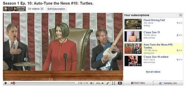
The update means that users can make changes to the size of the video screen, and YouTube has replaced the five star ratings model with a likes/dislikes system.
The company has also moved the content description to below the video in order to reduce the clutter on the right, where users are given a choice of videos to watch.
Comments have been given a new highlights view which summarises the best discussions and increases the incentives for creators to communicate with their audiences, according to YouTube.
The redesign has been in progress since the beginning of last year, and YouTube announced a test version of the streamlined video page in January for users to explore. Many of the comments made at the time were negative, and this sentiment appears to have continued.
"IDK, why'd you change it all of a sudden? I know for a while you had a beta on this. Surely the people said 'don't go along with it! keep the old one' and not 'change it anyway'," said YouTube user 'Richard'.
Another user called 'Maciek' added: "Too minimalistic, please make an option for those who want to use the old version."


.jpg&h=140&w=231&c=1&s=0)


 iTnews State of Data & AI Breakfast
 Forrester's AI Forum Sydney
 The 2026 iAwards
.jpg&w=120&c=1&s=0) Integrate 2026
Integrate 2026
 Security Exhibition & Conference


_(1).jpg&h=140&w=231&c=1&s=0)